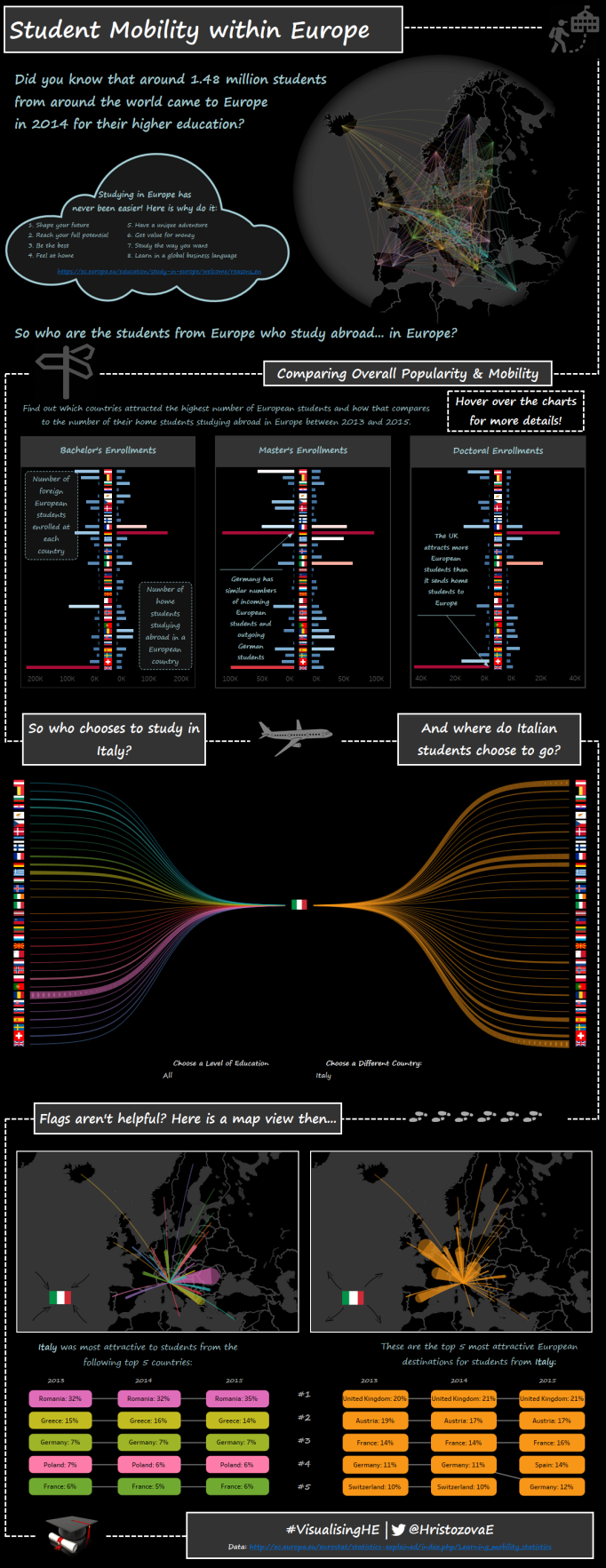
In today’s globally connected world we experience the notion of a border mainly when we go through passport control at the beginning or the end of a journey. For the education sector, it means that now studying abroad has never been easier, especially for those who live in Europe. So what does the student mobility within Europe look like?
To answer this question, I have decided to look at the Higher Education data from Eurostat and find out the number of enrolled students within each European country who are from a different European country. The full dataset contains student enrolments from some countries outside of Europe, too, but for the purpose of this exercise only European origin and destination countries have been included.
Why visualising student mobility within Europe?
Choosing the topic wasn’t easy. In fact, Dave Kirk helped me with this a few months ago when Dave, Adam , Stephen and I launched #VisualisingHE. He and Adam were enthusiastically listing topics and datasets they were looking forward to exploring as part of the project but I was struggling to come up with something that I could talk about with so much excitement.

Then Dave asked me: what are you passionate about? And it didn’t take me long to come up with an answer – I am an Eastern European and I cannot imagine who and where I would be today if I hadn’t been given the opportunity to undertake my bachelor’s degree in the UK! Therefore, I decided to look into the topic and develop a pretty, colourful and informal visualisation that represents the beauty of studying abroad… in Europe.
What influenced the design and choice of charts?
Probably the better question here is not ‘what’ but ‘who’ influenced the choices I have made as part of the design process. Having decided on the overall ‘feeling’ I wanted to my visualisation to convey, I had to think about whether I wanted my dashboard to be in a #coffeetableviz (i.e. poster) style or be leaning towards the exploratory side. I will leave it to you to decide where precisely on the informative vs. exploratory spectrum the end result lies, but I will let you know whose work gave me the inspiration:
- for poster style infographic I would always go to Pooja Gandhi’s fantastic work first: if you haven’t visited her tableau public profile, do it! I find her work truly inspiring – she knows how to deliver a clear message in a dataviz by seamlessly combining text and graphs.
- for visualising the inflow vs. outflow concept I was inspired by Neil Richard‘s viz on the Eurovision song contest. When I first saw his viz, I remember thinking: ‘Oh, well it is clear to me what the visualisation is telling me.’ Plus, I really liked the flags.
- for colours I got inspired by Jeffrey Shaffer‘s Beautiful Trash.
Then the idea of a Sankey sprung to my mind and that was it – I was going to do a Sankey and practice my great arc curves on a map. I started with the great arc curves as I had already done these for a project at work. For the data structure I followed this summary and to get the lines curved, I found this post useful. Building the Sankey wasn’t too difficult either – there are plenty of blog posts written by the community that explain how to do it. I read a few and after deciding I did not want to use custom SQL, I found this post helpful.
What were the challenges?
Just as I was thinking I was making some really good progress, I came across Ravi Mistry and Nicco Cirone‘s very interesting work on ERASMUS. It was great! I loved it… but it also had a map of Europe with curves, and a Sankey, and was talking about students studying in Europe… Oh dear, I didn’t want to copy their work… Even though I hadn’t seen it until I was alredy halfway there with my viz, if I were to use exactly the same combination of graphs would have still made me feel as if I had copied it. At this point I had two options: drop the topic, or think really hard how to make my visualisation different. A few days later I was going through some of my favourite dashboards on Tableau Public and then, inspired by Adam McCann’s beautiful Beatles Analysis, I decided to develop an ‘hourglass’, or a double Sankey, chart (I don’t know if this chart has a name) to show the inflow vs. outflow relationship. Not long after I had my first draft:

Another big decision making point in the process of developing this dashboard was around my choice of font. It crossed my mind that there is this thing about safe fonts for tableau public. After a quick check on Google I thought I should try and use a web safe font. My choice was Comic Sans. Yes, Comic Sans, because I was going for a fun artistic / informal look. Little did I know that there was something about Comic Sans… When I asked for some feedback on the way my dashboard was coming together, I got mixed reactions. I particularly like the contrast in Dave and Stephen’s comments:

After doing some reading on the internet and quite a few lengthy discussions with friends and colleagues at work, I decided that though I see nothing wrong in using Comic Sans for my dashboard (especially, since I am not saying: ‘Danger, Danger, the world is about to collapse’ … or something in those lines), I decided to change it. Simply because I didn’t want the font to distract from its overall purpose.
What did I learn?
- How to build a Sankey
- How to build an hour glass visualisation
- How to crop an image in GIMP (and add transparency to it)
- There is something about Comic Sans…
- How to use A LOT of containers (with very few of them floating!)
What are my personal challenges for the next viz?
- Don’t use a long-form dashboard
- Produce a dashboard with a non-black background
Thank you for reading and I hope you enjoy exploring the dashboard!

[…] public ‘viz of the day‘ accolades! My favourite is without doubt her solo post ‘destination Europe‘ a topic that really sang with her and it showed in her viz and really came over in her […]
LikeLike